Yes.
I Tried Windows 11.
Posted
on October 14,
2023
at
3:58 PM.
(return
to
Tech's
Blog)
Microsoft spent
more time on animations than fixing their software.
Recently,
I tried out Windows 11 on my main machine (and what I mean about tried is
that I upgraded my existing install of my stable Windows 10 Enterprise LTSB 2016
directly to Windows 11 Enterprise) and my experience with it was, eh. I've
ran into some issues where File Explorer tends to forget some of my folder's
preferences and saved columns, and one time when dragging files out of File
Explorer onto a different app would either cause it to lag horrendously or
outright forget that I'm dragging a file onto an app and doesn't "let
go" of the file and some performance drops that I never encounter while
using LTSB 2016.
The
problem with modern-day Windows is that, Microsoft forgot what made Windows, a
perfect OS for desktop computers instead of trying to cram Windows onto every
thing like handheld gaming consoles of all things and how Microsoft is focusing
on nonsense things like making animations look smooth and implementing AI into
Windows as I am not surprised that during its development in early 2021,
Microsoft had other engineers from different departments, like Office, Xbox,
Visual Studio, to all work on Windows which resulted in many inconsistencies
when it comes to user interface and its functions. Nevertheless I decided to
upgrade my current install directly.
Of
course, doing some patches so that Windows 11 can install on my computer, since
its TPM, EFI, and Secure Boot nonsense are apparently "required" to
run Windows 11, considering its still using BOOTMGR, dated back to Windows
Vista, which both support EFI and legacy boot! If Microsoft really, really,
really want to make Windows 11 EFI only, Microsoft would spend much time on
rewriting the boot loader (BOOTMGR) to remove legacy boot support, which I don't
think Microsoft would ever do, so hah. Oh, and having Microsoft to rework DISM
to prevent people from manually installing Windows 11 onto a hard disk. ;)
First look at
Windows 11.
Back
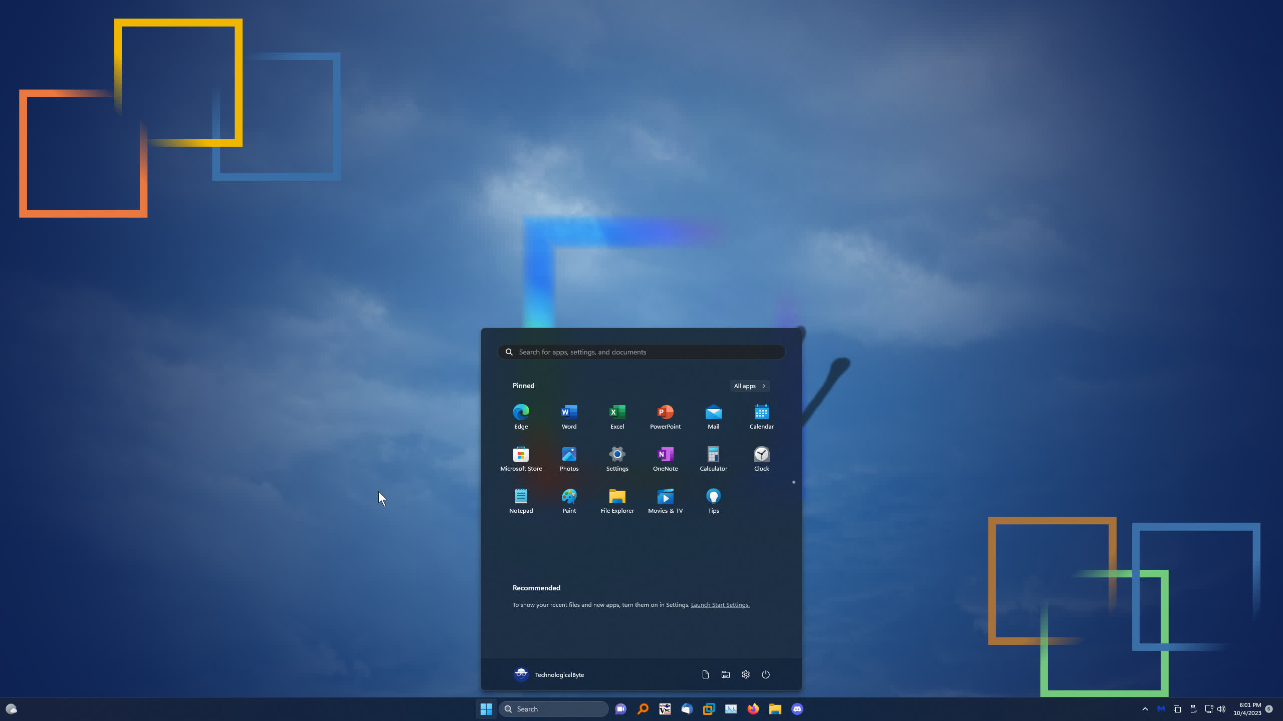
on topic, the image below is my desktop alongside the new Start menu with its
shortcuts to apps.
Click
to view larger image.
I'm
not really a big fan of the new Start menu. Sure, it doesn't have the infamous
"live tiles" from Windows 8, but if I want to go to my all apps list,
I have to click on a button. But didn't Microsoft get rid of the "All
Apps" button on the old Start menu on Windows 10 starting version 1607?
(which I actually think was a smart idea and was glad that it was implemented.)
Also, the "Recommended" section I don't use and that you can't truly
turn off without using patch tools. Now, if I'm designing the Start menu, there
should be an option to add the all apps list on the left side of the Start menu
which doesn't take as much room, enough for the pinned apps to be displayed on
the right side, or have the Start menu to only show the all apps list instead.

Click
to view larger image.
Oh
look! File Explorer finally got tabs support! It's not like I'd seen it before
on a development build of Windows 10, named Sets! Now yeah, I know the upcoming
version 23H2 would enable tabs in explorer to be torn off and reattached. (which
why wouldn't it be on 22H2?!) The window itself is a mix between WinUI 3
language and the legacy File Explorer code mashed together, why couldn't
Microsoft go full out and use WinUI 3 for File Explorer? Oh yeah, it'll take too
much time to get done, perhaps years, but haha Microsoft only have 2 years or
less to push an update for Windows 11 before your currently installed version is
discontinued and obsolete, thanks Windows as a Service!!
What's up with the
new Task Manager?
The
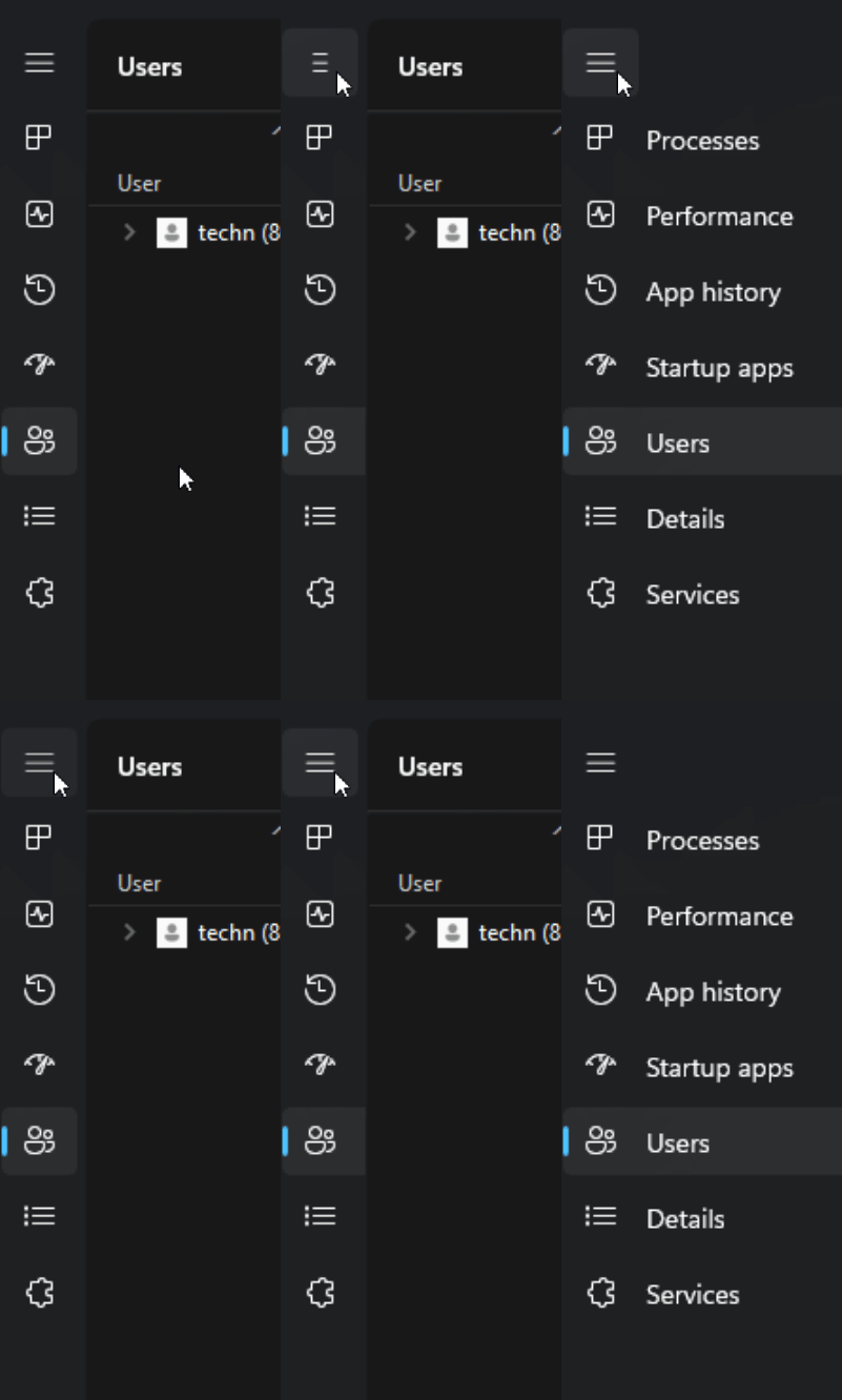
gif above shows the sidebar's lack of
the
"expand" animation. Click to view larger GIF.
Task
Manager. A very useful application for Windows NT. Microsoft "redid"
the interface for Task Manager and I gotta say, I'm not a fan. Like File
Explorer, it's using a mix of WinUI 3 language and existing code of the reliable
Task Manager, but hey! there's dark mode!!!!! In my honest opinion, controls
should be on top and not on the side with the hamburger menu. I've notice that
clicking on the hamburger icon to expand it, won't play the animation and
instead takes about a second to show the expanded view. My guess is that,
Microsoft lazily disabled the expand animation because Task Manager has to
redraw its content frame-by-frame so that the sidebar would play the expand
animation, but due to the nature of old design language, redrawing the frame
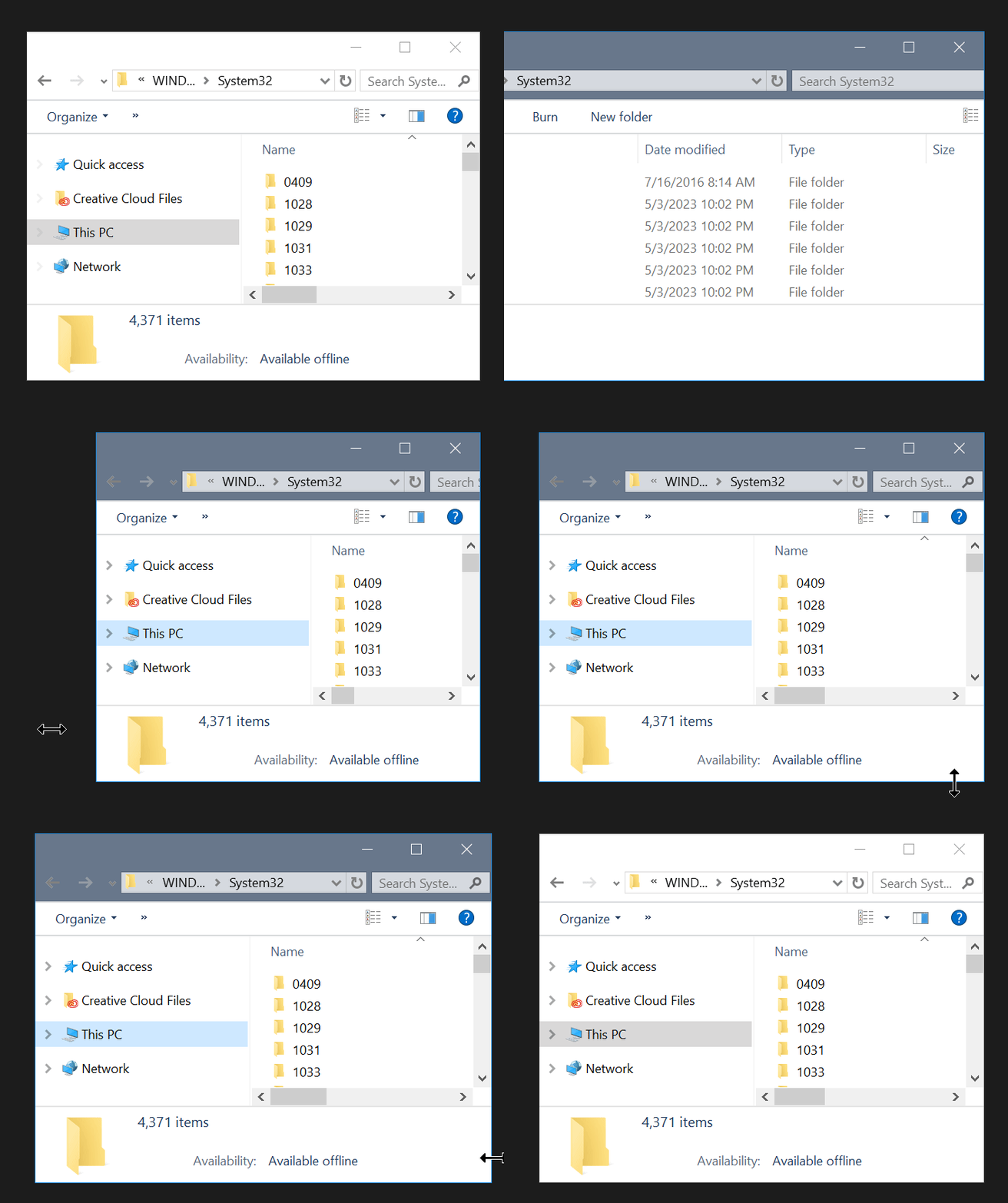
would result in a sloppy mess. It's like when you resize some applications, the
contents of the window would "tear". See the animation below on what I
mean by that.
As
you see above, the search bar "tears"
alongside
the scroll bar of the window.
Now,
the functions of the new Task Manager isn't new, but rather a sloppy redesign
that Microsoft did, in the sake of consistency. Don't get me started on 23H2's
version of Task Manager. The dialog box now shows inside the Window and isn't
responsive compared to the older dialog box.
OOOOH NEW DESIGN.
Same old code.
Yeah,
yeah, yeah. Microsoft utilized its engineers from different departments to help
develop Windows 11 by changing its design but keeping the underlying code of
Windows NT the same, just because Apple finally let go of version 10 back in
2020, and now increments its major version every year. Well, the
"redesign" of Windows seem to make people upgrade to a reskin version
of Windows 10, considering the fact back in 2021, Windows 10 had TWO development
channels for 21H2. First, being dedicated to the active development branch of
Windows 10 and the second being focused on implementing new features like the
new icons many people began seeing during development of Windows 10 Cobalt,
which ultimately became Windows 11.
Microsoft
surely did a great job on fooling people on how "new" Windows 11 is,
as the only thing that stands out is an interface redesign. Heck, using tools,
you can get some of Windows 10's interface on Windows 11 easily. Microsoft wants
to hide its flaws by making "smooth" and "flashy" animations
that caught people off-guard and praise Windows 11 for having smooth animations,
DON'T GET ME STARTED ON THAT "GEAR SPIN" EASTER EGG.
Windows
11 is still version NT 10.0, all what Microsoft did was focus way too much on
animations and refining the interface instead of fixing the operating system,
fixing bugs like poor performance, input lag, and nonsense bugs that ultimately
made people fall into buying a new GPU so that Windows 11 can be happy, even
though you don't have to. I don't need new flashy UI animations, all I want to
do is to get work done with an operating system that's stable and doesn't cause
trouble, hence why I'm sticking to Windows 10 Enterprise LTSB 2016, and if some
programs would to stop working, I'll make it work, or use an older version of
said app.
Windows-as-a-service
MUST GO.
It's
obvious. I want it gone. Why is Microsoft treating Windows like some kind of a
mobile operating system that has to be discontinued after two years? What's
wrong of having 10 years of support? Now, we only have two to three years of
support. But look, Microsoft wants to do this "three-year major features
update" thing, which they should've been doing since Windows 10! Now,
Windows 11 has a thing called "Moments" which it's similar to how
Windows got its new features, by installing Service Packs. Still, we want to
upgrade at our own convenience, not feel compelled to upgrade. I KNOW that I
only have 3 years of support left, which is why I've been working on my escape
route, in the event where I have to escape, like when my applications stop
working or what not. Hell, Microsoft would probably not care, since they only
care about AI, AI, AI and more AI nonsense into Windows rather than fixing their
operating system and make it great, like what it used to be back then.
I'm
not switching operating systems because everything I do on my current OS works
flawlessly and my applications I use continue to work! No reason to upgrade if
the tools you use continue to work. And the "new" features of Windows
11, I don't use at all! Hell, what about DirectStorage? Are there games out
there taking advantage of that? I don't need HDR because I DON'T OWN an HDR
monitor! Game mode? Yeah, no improvements at all other than hogging your
system's resource for that one particular application and makes other apps be
slow as heck.
Whatever.
I'm not going to Windows 11 anytime soon. Also speaking, I had enough and I went
back to my previous version and everything went according to plan right???
Well.... mmmmm-no.
Going back to my
previous version broke things. Nice job!
Wow!
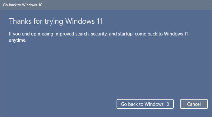
What a very snarky dialog box, telling me I can
come
back to Windows 11 anytime.
So
I went back to my stable system, using the go back feature. Yes, it restored my
system but things went missing. All of the sudden, my useful pinned folders on
my quick access section were all gone, like completely gone. If I hadn't made
any backups I would be pissed.
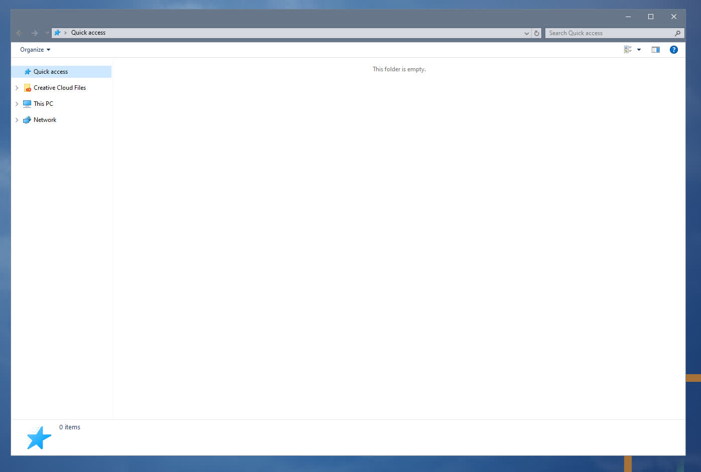
Oh
no! Windows 11 got so mad at me,
it
decided to clear my quick access!
Click
to view larger image.
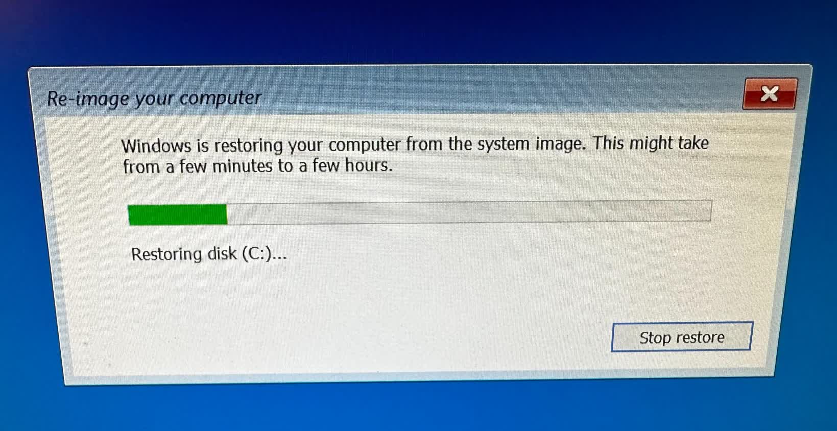
Luckily,
I made a system image backup prior to upgrading to Windows 11. I decided to boot
into Windows Setup and restored my system the way it was before Windows 11, and
all went according to plan, though it took almost an hour to complete, but hey!
Good as new!
Click
to view larger image.
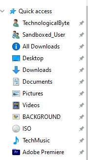
After
half an hour went by, there's my useful shortcuts that Windows 11 decided to
delete for some reason.
Click
to view larger image.
Well.
yeah. I'm not going back to Windows 11 anytime soon, considering it's still a
mess out there, I shouldn't be surprised. Although my applications still work on
Windows 11, I had many performance issues to nonsense bugs that were occurring
many times, I had to go back.
Remember,
newer isn't always better! Continue using old software!
TechnologicalByte
| 